Overview:
Figma is a cloud-based design tool that has gained significant popularity in the realm of UX/UI design. Its collaborative nature and versatile features make it an excellent choice for teams and individual designers alike. Figma offers a platform for designing, prototyping, and sharing work all in one place, streamlining the design process and encouraging team collaboration. In this dynamic environment, knowing various tips and tricks becomes crucial, as they can greatly enhance efficiency and creativity, allowing users to fully leverage Figma's potential and tailor their workflow for optimal results.
Figma is a modern, cloud-based design tool that has transformed the landscape of digital design, particularly in the realms of UI and UX. It's a versatile platform that combines interface design, prototyping, and collaboration into a singular, user-friendly application. Key features of Figma include vector graphic editing, interactive prototyping, real-time collaboration, and a comprehensive set of plugins and integrations. Being browser-based, it offers unparalleled accessibility and flexibility, enabling designers to work from anywhere and share their work effortlessly.
Who Needs Figma?

- UI/UX Designers
- Web Designers
- Mobile App Designers
- Graphic Designers
- Product Managers
- And Many More
Steps to Use Figma
- Account Creation and Setup:
- Sign up for a Figma account and choose the appropriate plan based on your needs.
- Familiarize yourself with the Figma interface, including the toolbar, layers panel, and assets library.
- Starting a New Project:
- Create a new file and set up frames for your design project.
- Utilize layout grids and guides to establish a consistent structure.
- Designing Interfaces:
- Use vector tools and shape layers to create design elements.
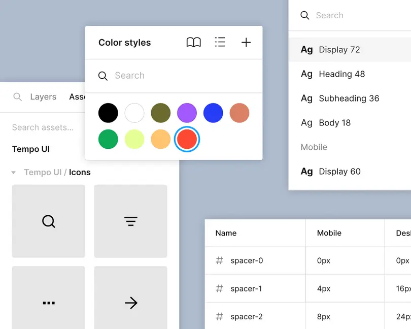
- Apply text styles, color styles, and effects for consistent branding.
- Implement Auto Layout to maintain padding and spacing as elements change.
- Using Components and Variants:
- Create reusable components for buttons, icons, etc., for consistent design elements across your project.
- Use variants to manage different states of a component, such as hover or pressed states.
- Prototyping:
- Switch to Prototype mode to add interactions and transitions between frames.
- Define triggers and animations for your prototype.
- Collaborative Features:
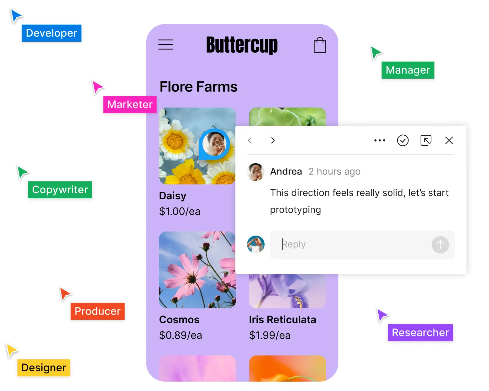
- Share your design file with team members for real-time collaboration.
- Use the comment feature to gather and address feedback directly in Figma.
- Testing and Exporting:
- Preview your designs and prototypes to ensure they meet your expectations.
- Export assets and code snippets for hand-off to developers.
Tips and Tricks to Enhance your Design in Figma
1) Figma Communities
Figma Communities are an integral feature of Figma, acting as a vibrant hub where designers can connect, share, and learn from one another. They are particularly valuable for UX/UI designers, as well as other professionals in the design field, for several reasons:
- Knowledge Sharing: Communities in Figma provide a platform for designers to share their work, insights, and best practices. This open exchange of information fosters a learning environment where both new and experienced designers can find inspiration and solutions to common design challenges.
- Resource Pool: Designers often share templates, UI kits, and design systems in Figma Communities, making it a rich resource pool. These shared assets can save time and effort, especially for those starting new projects or looking to learn new design patterns.
- Networking: Being part of Figma Communities allows designers to connect with peers and industry leaders, opening opportunities for collaboration, mentorship, and professional growth.
- Feedback and Collaboration: Designers can receive constructive feedback on their work from a diverse audience, which is invaluable for refining their designs and improving their skills.
- Trend Awareness: Communities help designers stay updated with the latest design trends, tools, and techniques, ensuring they remain relevant in a rapidly evolving field.
Example of a Valuable Community Resource
One excellent example of a community resource is the Customer Journey Map and User Flow Template available on Figma.
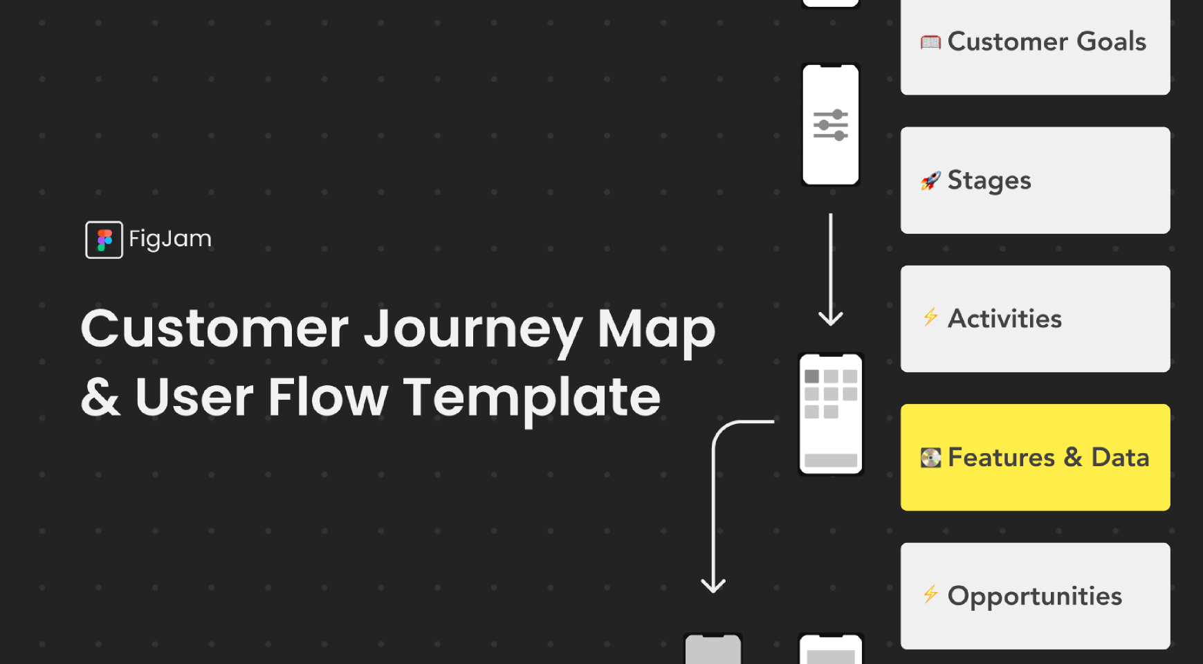
This template offers several advantages:
- Efficiency in Design: It provides a well-structured framework for mapping out customer journeys and user flows, saving designers the time and effort required to create these from scratch.
- Enhanced Understanding: By using this template, designers can gain a clearer understanding of the user's experience, making it easier to identify pain points and areas for improvement.
- Customization: The template is customizable, allowing designers to tailor it to the specific needs of their project or organization.
- Collaborative Tool: Since it’s shared on Figma, teams can collaboratively work on the template in real-time, ensuring all stakeholders are aligned and can contribute their insights.
- Educational Value: For those new to creating customer journey maps or user flows, this template serves as an educational tool, demonstrating best practices and guiding them through the process.
2) Keyboard Shortcuts
- Duplicate Elements: Use
Cmd/Ctrl + Dto quickly duplicate any selected element, which is far faster than copy-pasting. - Group Elements: Press
Cmd/Ctrl + Gto group selected elements. Grouping is essential for organizing similar elements and managing them as a single unit.
3) Component Sets and Variants
- Organize Components: Group related components into sets for easier navigation and use in your designs.
- Manage States Efficiently: Create variants of a component for different states (e.g., hover, clicked) within the same set, allowing for more streamlined design and prototyping.
4) Auto Layout
- Responsive Containers: Use Auto Layout to create containers that resize based on their content, essential for designing responsive interfaces.
- Adjust Padding and Spacing: Auto Layout allows for consistent padding and spacing adjustments, which adapt as you add or remove elements.
5) Plugins
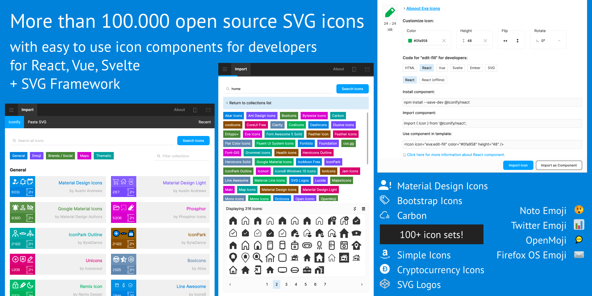
- Icon Sets and UI Kits: Plugins like 'Iconify' provide access to a vast range of icons, while UI kits can accelerate the design of common interfaces.
What It Does: The Iconify plugin for Figma offers designers access to a massive collection of icons from various icon sets. It allows you to search, preview, and insert icons directly into your Figma designs. With a wide range of icons available, Iconify covers various styles and categories, making it a comprehensive resource for iconography.
Why It's Useful: Icons play a crucial role in interface design, often serving as key elements for navigation and user interaction. Iconify streamlines the process of finding and implementing icons, ensuring designers have a vast selection at their fingertips. This plugin saves time and enhances the visual appeal and usability of designs, providing an efficient way to incorporate icons without the need for external resources or additional software.
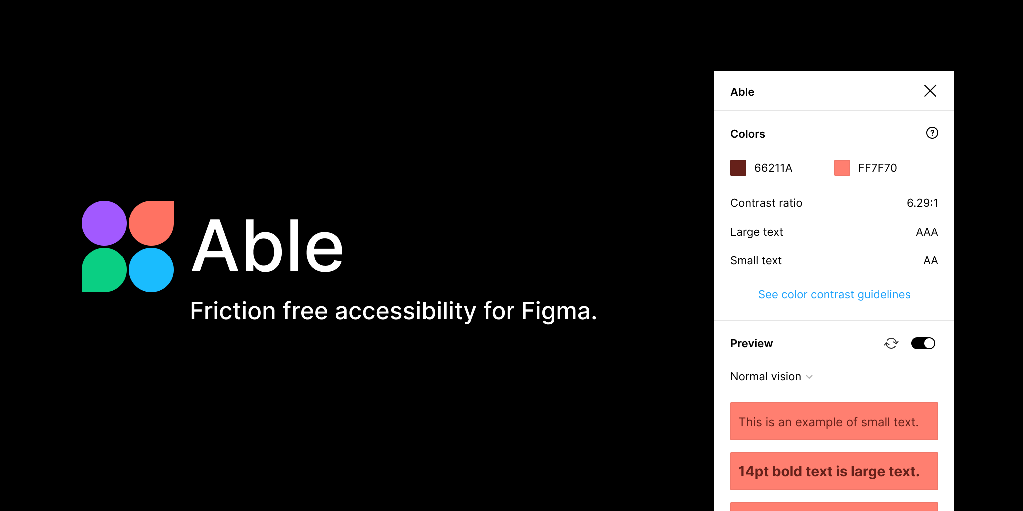
- Accessibility Checks: Use plugins like 'Able - Figma Accessibility Checker' to ensure your designs meet accessibility standards.
What It Does: ‘Able - Figma Accessibility Checker’ is a plugin designed to evaluate and ensure that your designs adhere to accessibility standards. It checks various aspects of your design, such as color contrast, text size, and visual hierarchy, providing insights and recommendations for improvement.
Why It's Useful: Making designs accessible is crucial in creating inclusive products that cater to a diverse user base, including those with disabilities. This plugin aids designers in identifying potential accessibility issues early in the design process. By integrating accessibility checks into the workflow, designers can create more user-friendly and compliant interfaces, ultimately leading to products that are accessible to a wider audience and meet legal and ethical standards.
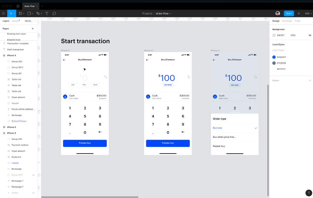
- Streamlining User Journey Mapping: Plugins like "Autoflow" transform the way designers create and visualize user flow diagrams.
- What It Does: Autoflow is a plugin that streamlines the process of creating flow diagrams in Figma. It allows designers to easily connect frames and objects with arrows, illustrating the flow of user interactions or the navigation structure within an app or website.
- Why It's Useful: This plugin is particularly helpful for UX designers who need to map out user journeys or present the logic behind screen transitions. It simplifies a typically time-consuming task, making it easier to visualize and communicate the user flow to team members or stakeholders.
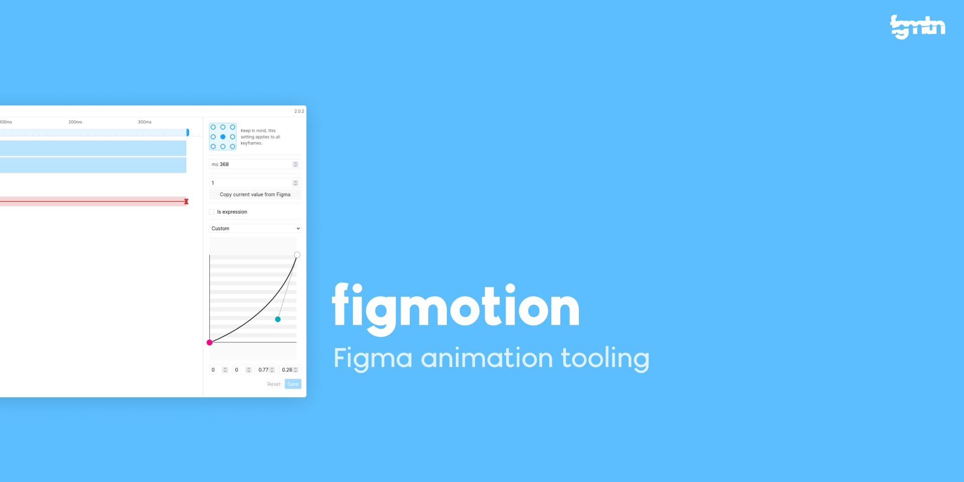
- Animation within Figma: To bring designs to life, incorporating plugins like "Figmotion" into your Figma toolkit allows for the creation of complex animations directly within the design environment, enhancing the interactivity and dynamism of your prototypes.
- What It Does: Figmotion is an animation plugin that brings timeline-based animation capabilities directly into Figma. It allows designers to create and edit animations without leaving the Figma environment.
- Why It's Useful: With Figmotion, designers can animate objects, experiment with easing and durations, and preview animations in real-time. This plugin is ideal for designers looking to add subtle interactions or animations to their designs, enhancing the overall user experience and providing a more dynamic prototype.
- Diversifying Design Content: Plugins like "Content Reel" equip Figma users with a variety of text, image, and icon options, enabling them to populate their designs with realistic and diverse content effortlessly.
- What It Does: Content Reel helps designers populate their designs with text, images, and icons. It provides a variety of content types like names, addresses, avatars, and more, which can be easily dragged and dropped into designs.
- Why It's Useful: This plugin is invaluable for creating more realistic and diverse designs, especially when working on user interfaces that require a lot of data. By using realistic content, designers can better visualize how the final product will look and function, leading to more informed design decisions.

We have already talked about:
6) Version History
- Track and Revert Changes: Figma’s version history allows you to see who made changes and when, and you can revert to previous versions if necessary.
7) Shared Libraries
- Centralize Brand Assets: Create libraries of colors, text styles, and components that can be used across multiple projects to ensure brand consistency.
- Efficient Team Collaboration: Shared libraries allow team members to use and update common assets in real-time.
8) Effective Layer Naming
- Descriptive Naming: Use clear and descriptive names for layers and frames. For example, name a button layer as 'Button - Primary' instead of just 'Rectangle.'
- Layer Management: Proper naming is crucial for easy navigation and understanding, especially in complex projects with multiple collaborators.
9) Constraints for Responsive Design
- Apply Constraints: Set constraints on elements relative to their parent frames to control how they resize and reposition on different screen sizes.
- Test Responsiveness: Regularly test your designs in different frame sizes to ensure the constraints work as intended.
10) Use of Frame vs. Group
- Frame Usage: Frames are more versatile than groups and are used for creating design layouts. They can have fixed dimensions and hold other frames.
- Group Usage: Groups are best for organizing elements that you want to move or manipulate together but don’t require the structural properties of a frame.
Figma is not just about its comprehensive feature set; it’s also about the efficiency and collaboration it brings to the design process. These tips and tricks are just the beginning of what you can achieve with Figma. As you become more familiar with the tool, you'll discover even more ways to enhance your workflow and collaborate effectively with your team. Figma’s continuous updates and robust community support make it a tool that adapts to the evolving needs of designers, ensuring it remains a top choice in the world of digital design.


